Visual interfaces have shifted from simple flat boxes to immersive, layered environments. In this guide, we review the premium UI/UX design trends that dominate high-conversion web platforms.
When a visitor lands on your site, they form an opinion on your brand within 50 milliseconds. Generic templates and browser-default colors immediately look cheap. Modern design systems require rich glassmorphism structures, tailored HSL color palettes, and micro-animations to create a premium feel.
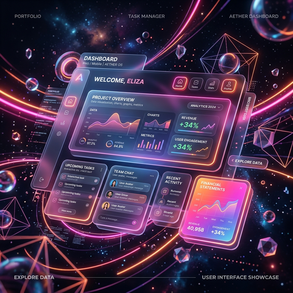
1. Glassmorphism & Depth Layouts
By combining semi-transparent background colors with active backdrop blurring, glassmorphic panels establish a clear layout hierarchy. Users perceive the transparent layers as floating elements, separating interactive forms from global page backgrounds.
2. Tailored HSL Color Token Systems
Relying on standard HEX colors makes managing dark mode variations and brand styling highly complex. By defining color systems using HSL (Hue, Saturation, Lightness) tokens, developers can shift lightness percentages dynamically while preserving color harmony.
| Color Level | HSL Token Variable | Visual Rationale |
|---|---|---|
| Brand Primary | `hsl(263, 100%, 69%)` | Vibrant indigo violet, establishes brand focus points. |
| Theme Accent | `hsl(194, 100%, 50%)` | High-contrast cyan, draws attention to key CTA nodes. |
Summary
Premium UI/UX is not just about aesthetics; it directly reduces user bounce rates, conveying professional brand authority that aligns with Google E-E-A-T trust signals.
Looking to redesign your digital system? Connect with WebNex's UI/UX designers to audit your platform interface.